Empty State & Error Illustrations — 40 Themeable SVG Scenes
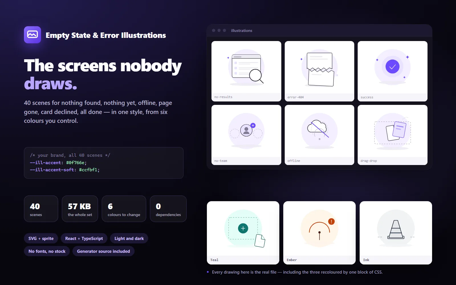
40 scenes for the moments every product has and nobody draws: nothing found, nothing yet, offline, page gone, card declined, all done. One style, and six CSS variables that recolour the whole set to your brand in one block.
Empty State & Error Illustrations — 40 Themeable SVG Scenes
What it does & who it's for
Every product has the same dozen screens that nobody gets round to designing. No results. No data yet. You are offline. That page does not exist. Your card was declined. All done. They are the moments a user is most likely to be confused or annoyed, and they usually get a blank rectangle.
This is 40 of them, drawn as one set.
What makes it a set rather than a folder: one canvas, one palette of six colours, one family of stroke weights and corner radii, and no people. That last rule matters more than it sounds — a set with figures in it needs every new drawing to match a face, a body and a skin tone, which is exactly where hand-assembled collections fall apart. Objects stay consistent.
Six colours, and every one is a CSS variable. Declare them once — accent, accent-soft, line, surface, ground, mute — and all 40 scenes take your brand at the same time. There is no per-file editing, no rebuild, no second version to maintain. Dark mode is the same files with the values swapped, which is why the set is 40 drawings rather than 80.
One caveat, stated up front because it decides how you use them: CSS variables only reach an SVG that is inline in the page. The React components and the sprite both put the markup in your page, so they take your colours. An <img> tag renders the file in its own document and keeps the built-in violet — which is fine if you like it, and covered three ways in the documentation if you do not.
Nothing here was drawn by hand in a vector editor. Every shape comes from the code in the download — a small drawing kit of primitives, a library of objects, and 40 scene definitions. That means no stock imagery, no traced references, no icon fonts and nothing to clear with a client. It also means the set is yours to change: adjust the stroke weights and all 40 get bolder; swap the note of the palette and all 40 follow; add a scene of your own and it joins the SVGs, the sprite, the React components and the TypeScript union automatically.
The build measures itself. A quality pass checks that every drawing sits inside its canvas, near enough to centre that a grid of them lines up, uses only the palette, only the set's stroke weights and corner radii, carries a title, and contains no text, images or fonts. It is how 40 drawings stay even — and it runs on your changes too.
The documentation spends most of its words on the part that is actually hard: an empty state is a sentence, a button and then an illustration, in that order. There is a guide on choosing the scene that matches what really happened, one on theming, one on accessibility — the drawing must never carry meaning on its own — and one on regenerating the set.
The demo is the set: all 40 playable against a live palette you can change, a mock screen showing one in the place it actually goes, working code for four integration paths, and the documentation.
Details
- Number of assets
- 40
- File formats
- SVG
- Resolution
- 400 × 300 viewBox — vector, any size
- Editable source files included
- Yes
- AI in this work
- AI-assisted (edited or composited by a person)
What's included
- svg/ — 40 standalone SVG files, 57 KB for the whole set, and no file over 2.3 KB
- sprite/ — all 40 as symbols in one file, for a single request
- react/ — every scene as a React component, plus TypeScript definitions with all 40 names as a union
- css/ — the six variables in light and dark, and a sensible default size
- web/ — a 1 KB helper that mounts the sprite so plain HTML gets themeable scenes too
- documentation/ — getting started, theming, choosing a scene, using them well, and regenerating the set
- source/ — the generator: the drawing kit, the object library, the 40 scene definitions, the build and the quality checks
- index.json — every scene with its group, title and what it is for
- README.md, LICENCE.md and THIRD-PARTY.md
What's not included
- People, mascots or characters: the set is deliberately objects only
- Icons: these are 400×300 scenes, not a 24px icon system
- Animation: nothing moves, on purpose — the documentation explains how to animate the element yourself if you want to
- Figma, Sketch or Illustrator files: the editable source is the generator, not a design file
- Raster formats: SVG only (export PNGs yourself at any size)
- Exclusivity: this is a non-exclusive licence and other people buy the same set
Requirements
- To use the SVGs: nothing. They are ordinary files
- To use the React components: React 18 or later
- To theme them: a browser that supports CSS variables (every browser since 2016)
- To regenerate the set from source: Node.js 18 or later
Setup instructions
- Download and unzip the package.
- Copy svg/ somewhere your server serves — public/illustrations/, for example.
- Use one: <img src="/illustrations/no-results.svg" alt="" width="280">.
- To put them in your brand colours, copy css/illustrations.css and change the six variables — then use the React components or the sprite, because an <img> cannot see your CSS.
- Read documentation/using-it-well.md before you ship. It is short, and it is the difference between an empty state that helps and one that is merely decorated.
Version history
- v1.1Latest19 Sept 2026
- v1.019 Sept 2026
Licence & terms
12 months email support
Licence terms
Non-exclusive commercial licence. Use the illustrations in unlimited projects: your own apps, websites, products and prototypes; in client work, including handing the files to that client as part of it; in products you sell and apps you publish to a store; and in documentation, slides and marketing for what you have made. Recolour, crop, combine, redraw, or run the included generator to produce your own version of the whole set. Ship the React and helper code, changed or not, inside your app. No attribution is required, the licence does not expire, and there is no reporting or revenue share. You may not resell or redistribute the illustrations as illustrations — as an asset pack, icon set, template resource or course download — or upload them to a stock library or asset marketplace, or register one as a trademark. The artwork contains no third-party material, so there is nothing else to clear. Full terms in LICENCE.md.
Refund policy
14-day refund if the product is materially not as described — for example files missing from the download, artwork that does not render, or a set that is not what this listing says it is. Change of mind is excluded: all 40 scenes are visible at full size in the demo before you buy, and you can recolour them there, so you can judge the actual product rather than a description of it. Nothing here limits your rights under Australian Consumer Law. An approved refund ends the licence: stop using the illustrations in anything new and remove them from work not yet published.
Support terms
Email support for 12 months from purchase, for questions about using or theming the set and for defects in what this listing describes. Email support@launchstock.app or reply to your receipt, and a person answers. Defects are fixed free within that period. Help choosing scenes for your product is included within reason; custom illustration, new scenes made to order, and changes to your own code are not.
These terms are snapshotted at purchase — what you see here is what applies to your order.
Reviews
No reviews yet
Reviews come from verified purchasers only, so you can trust what you read here.