Preparing for launch…
LaunchKit UI — React + Tailwind Component Pack
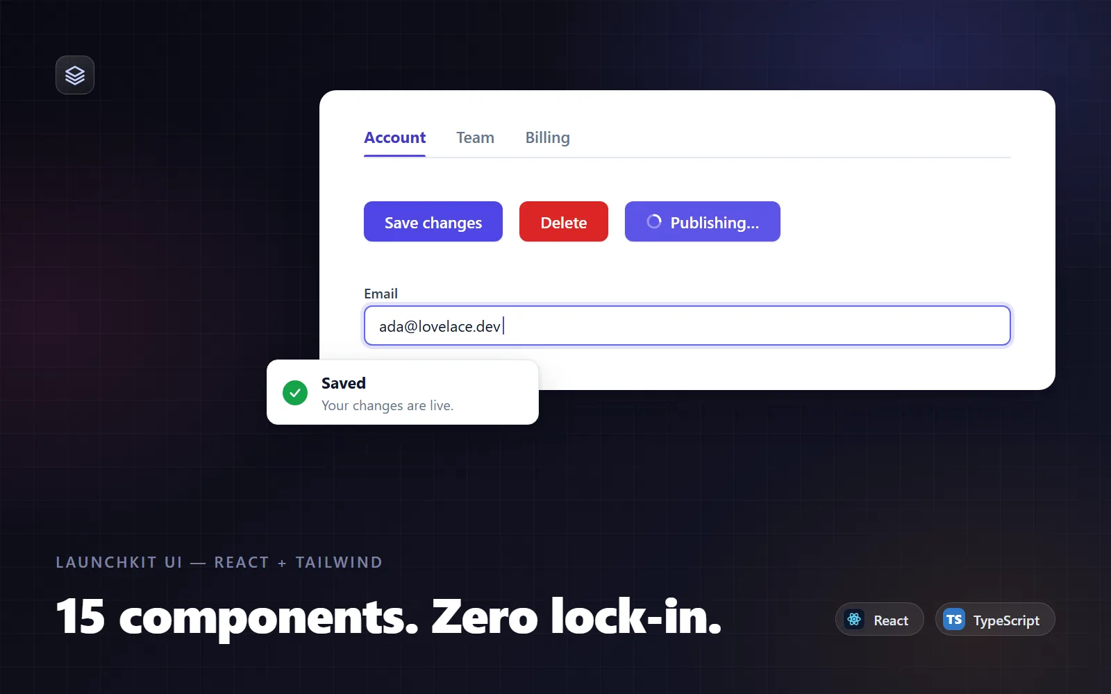
15 accessible, production-ready React + Tailwind components in TypeScript — copy them in, register one preset, ship.
What it does & who it's for
LaunchKit UI is a pack of 15 production-quality React components — Button, Input, Select, Modal, Toast, Tabs, Accordion, Tooltip, Dropdown Menu, Badge, Card, Avatar, Skeleton, Pagination and EmptyState — written in TypeScript and styled entirely with Tailwind utility classes. There is no npm package to install and no runtime dependency beyond react and react-dom: you copy the folder into your source tree, register one small Tailwind preset, and the components compile with the rest of your app. It is built for developers shipping SaaS dashboards, admin tools and product UIs who don't want to adopt a heavyweight design system or pay the integration tax of a headless-UI library. Because the source lives in your repo, you can change anything — no fighting prop APIs, no waiting on upstream releases, no version lock-step between a component library and your Tailwind config. The hard parts are already done. The Modal has a real focus trap with focus restore and body-scroll locking; Tabs implement the WAI-ARIA roving-tabindex pattern with arrow-key navigation; the Dropdown Menu follows the menu-button pattern with Home/End and Escape handling; Toasts are announced politely via role="status" and pause their timers on hover; Inputs and Selects wire hints and errors through aria-describedby. Every component ships with JSDoc'd props, sensible defaults and a copy-paste example in usage-examples.md. Why not DIY? Writing these 15 components properly — keyboard support, ARIA wiring, edge cases like focus restoration and hover-paused timers — is comfortably a week of engineering. Here, rebranding is a one-file change: swap the eleven-step primary colour scale in tailwind-preset.js and every button, focus ring, active tab and pagination pill follows. Try the live demo first — it shows every component you're buying — then drop the source into your project in about five minutes.
What's included
- 15 TypeScript component source files (components/*.tsx): Button, Input, Select, Modal, Toast, Tabs, Accordion, Tooltip, DropdownMenu, Badge, Card, Avatar, Skeleton, Pagination, EmptyState - index.ts barrel export with full prop-type exports - tailwind-preset.js design tokens: primary colour scale plus entrance animations - README-setup.md: install steps, Tailwind v3 and v4 configuration, Next.js App Router notes, troubleshooting - usage-examples.md: copy-paste snippets for every component plus a complete settings-page example
What's not included
- No compiled JavaScript build — this is .tsx source; your bundler compiles it - No icon library — icon slots accept your own SVGs or any icon set - No dark-mode variants out of the box (the class structure makes adding them straightforward) - No Figma or design files - No data-heavy components (tables, date pickers, charts) — the pack covers the 15 primitives listed
Requirements
React 18 or 19 with react-dom; Tailwind CSS 3.4+ (v4 supported — instructions included); a bundler or framework that compiles TSX (Next.js, Vite, Remix, CRA, Astro + React); TypeScript 5+ recommended.
Setup instructions
1. Download the deliverables and copy the folder into your project, e.g. src/components/launchkit/. 2. Register the Tailwind preset in tailwind.config.js — presets: [require('./src/components/launchkit/tailwind-preset')] — and make sure the folder is covered by your content globs. 3. On Tailwind v4, either point at the JS config with @config or copy the tokens into @theme; both routes are spelled out in README-setup.md. 4. Import components from the barrel: import { Button, Modal, useToast } from '@/components/launchkit'. 5. If you use toasts, mount <ToastProvider> once at the root of your app. 6. To rebrand, replace the eleven primary colour steps in tailwind-preset.js — every component follows automatically.
Version history
- v1.0Latest3 Aug 2026
Licence & terms
Licence terms
Single-project commercial licence. You may use LaunchKit UI in one commercial or personal project (one production deployment), modify the source freely, and ship it as part of that project. You may not resell, redistribute, sublicense or repackage the components — modified or not — as a component library, template, starter kit or competing product, and you may not share the source outside the team working on the licensed project. Purchase one licence per project.
Refund policy
14-day refund policy: if the pack is materially not as described, contact us within 14 days of purchase for a full refund. Please try the live demo first — it faithfully previews every component you're buying, so you know exactly what's in the box before you pay. Refunds are not offered for change of mind. An approved refund ends your licence to the product — you must delete all copies of the files and stop using them.
Support terms
Email support for setup questions, bug reports and integration help (Next.js/Vite/Remix configuration, Tailwind preset issues) for 6 months from purchase. Custom feature development and project-specific styling work are out of scope.
These terms are snapshotted at purchase — what you see here is what applies to your order.
Reviews
No reviews yet
Reviews come from verified purchasers only, so you can trust what you read here.
More in Developer Tools
Other listings buyers compared with this one.
 Test-run
Stackmesa SaaS Starter
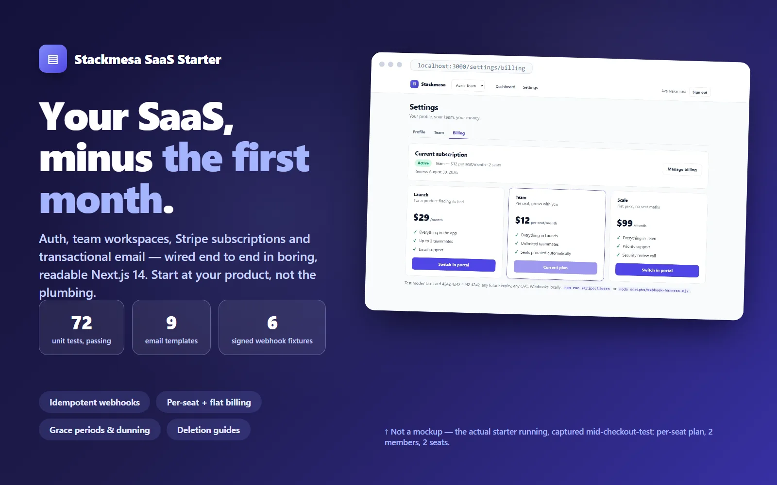
A production-grade Next.js 14 SaaS starter — auth, team workspaces, Stripe subscriptions and transactional email wired end to end, tested, and documented so every module can be deleted cleanly.
5.0(1)
Live demoStackmesa$399
 Test-run
API Starter — Express + TypeScript
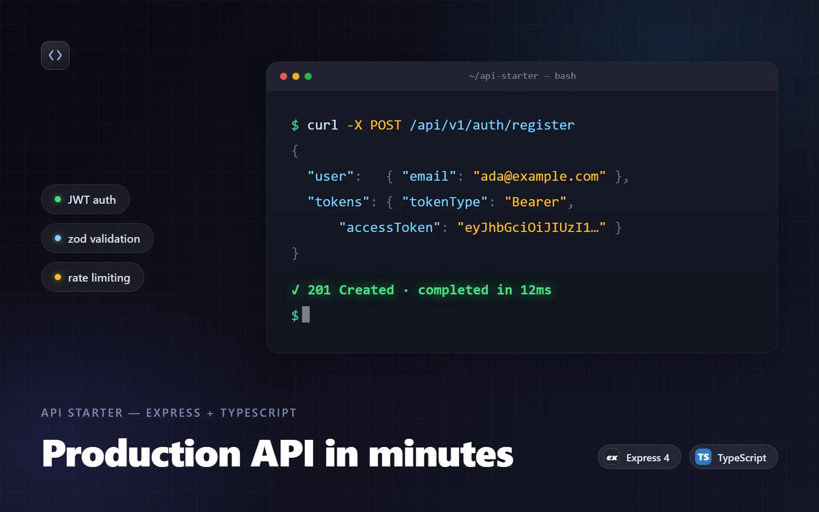
Production-grade Express 4 + strict TypeScript REST API starter: JWT auth with refresh rotation, zod validation, typed errors, rate limits.
Live demoStackmesa$49